Graphic Design Rules For Your Social Media
Creating the visuals (graphic design) for your own marketing campaign has never been easier with the introduction of tools like Canva and Spark.Adobe.
Many of the design elements are there for you to select from, but there are still visual rules you should consider when creating successful slides for your marketing campaign.
Maintain the visuals of your brand across all your social media and online presence.
Your brand needs to be clearly recognised; use a palette of colours and stick to the same fonts.
A rough rule of thumb is up to 5 colours and up to 3 fonts across all your branding is sufficient to maintain a clear message.
However, all your social media slides should not look the same. Your customers will glance over them believing they’ve seen them before, so your slides need to show that they belong in one series but have enough individuality to stand out from each other.
Whatever online tool you use to create your visuals you will be offered a vast array of fonts. Do think about who you are trying to appeal to and remember that sans-serif fonts tend to be the easiest to read. These are the more modern group of fonts that don’t include any inflections at the ends of letters, they tend to have a greater pixel count and therefore appear heavier and stand out better online.
Of all the fonts Helvetica is viewed as one of the most popular typefaces because of its visual clarity.
Legibility of Design
Increasing the contrast between the images/text and the background will make the message stand out and greatly help improve the legibility of your design.
Black can be laid over a background to tone it down and improve the contrast if you have white lettering or you can increase the transparency of your background, leaving the images and fonts more solid so they stand out.
Colour Choices
Use complimentary colours. Refer to a colour wheel if you are not sure what colours complement each other, but remember that two complimentary colours of the same intensity will not sit together well and the lines will blur as they fight for attention.
It is therefore important to bring down one colour and increase the contrast with light on dark or dark on light.
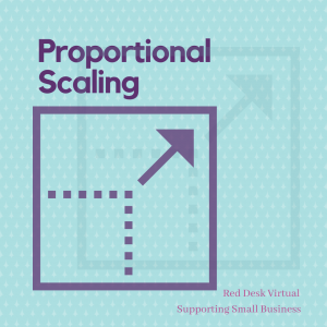
This applies to both images and text. If you are resizing you must drag from the corner of your image / text to change the size, this will ensure the object scales up or down proportionally, if you drag from the side you will stretch rather than scale your object, which is very unsightly.
Also remember small images do not scale up well so start with a large image and scale down.
Alignment
Make sure your text and images are not randomly scattered across your slide, this will be hard to ready and look disorganised.
Use the guidelines to align all your elements in relation to each other. Set a rule for alignment and stick to it, help your viewers eyes work across the slide with clear organised text placement.
Visual Importance
Decide on the hierarchy of your content, which information is the most important? Design the font accordingly, using colour and scale. Clearly reveal the order the viewer needs to read the information so they understand your message.
Always proof read your work thoroughly, spelling or grammar mistakes are a huge barrier to getting your marketing message across. Do you have someone that can proof read for you or can you download a software (although this is not always full proof).
Less can be more
Don’t be afraid to leave space in your design, consider carefully what you need to include, well-chosen images and text with space to breath will give your design clarity and strengthen your marketing message.
If you need any help with your digital marketing campaign then do get in touch: lindsay@reddesk.co.uk


